If you like collecting, representing, and analyzing data then you must know that drawing scatterplots is very beneficial. However, most people find it hard to make a scatter plot and find a line of best fit when it comes to google sheets and Excel. But I like using google sheets since it has many more advantages than Excel. Building a scatterplot and a line of best fit also known as the trend line is very easy following these simple steps.
A scatterplot helps us to find the direct correlation between coefficients. Let’s take an example of water on the heat. The correlation is that the water will become hotter as we add more heat.
Steps for making a scatterplot
First before making a line of best fit you need to have the scatterplot ready.
1. Highlight on the data that you want to create a scatterplot of
2. Click on insert chart
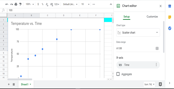
3. Then change the style to scatterplot from the column
4. On the Horizontal axis uncheck the “treat labels as text box”
5. To draw a line of best fit, check the trend line checkbox.
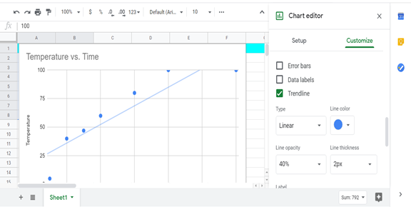
6. That’s it your line will be auto-populated
You can also view the formula that shows the strength of the correlation between your two variables by checking the show R2 checkbox. You will find these techniques useful as a student or researcher gathering real data and tabulating it.
How to customize your scatterplot and line of best fit
Let’s face it not the default features on google sheets cannot satisfy everyone’s work visually. That’s why Google sheets give you a chance to customize your gigs to match your theme.
Steps
1. Click on the 3 vertical dots in the chart to trigger the chart editor
2. Click on customize
3. Change color, font size or point shape according to what you like
You can also change the color of your gridline to the font and text size of your headings and subheadings. That’s it for drawing a line of best for a scatterplot in google sheets. Follow the same steps if you want to draw a trend line (Line of best fit) for any other chart.