
A histogram is defined as a chart describing how certain data is distributed through partitioning the range of data and expressing the number of values in which each partition falls.
Simply and quickly, I will use screenshots to explain how to create a histogram in google sheets.
Steps for Creating a Histogram
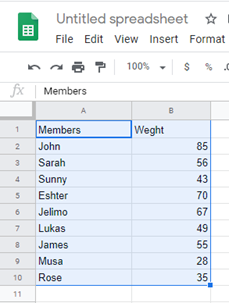
1. Select the data to be used in the graph.
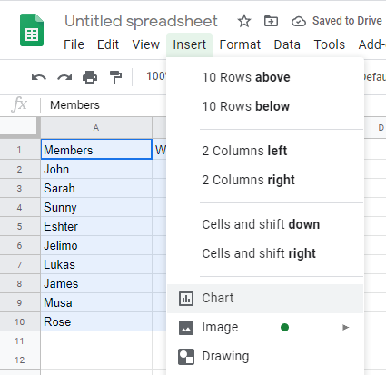
2. On the menu bar, click Insert and select Chart.
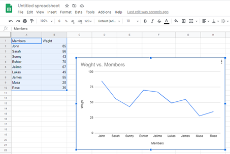
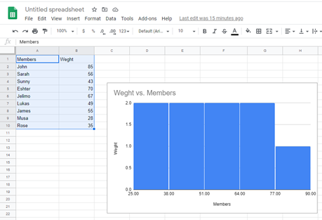
Google sheets automatically generate a graph as shown below.
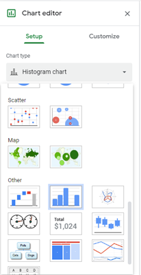
3. On the right side of the screen, click Setup then selects the graph of your choice from a range of selections ranging from line graphs, bar graphs, scattered graphs, column graphs, etc. In our case, we are going to select a Histogram found in ‘Others’ command when you scroll down.
After entering the command, this will be our outcome.
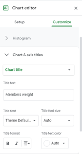
Google sheets allow you to customize your chart further in the menu found in the dialogue box which shows when you double click inside the cart. This feature allows you to change the data range as well as switch columns and rows.
4. Click Customize> Chart Axis & Titles> Chart title then click in the box below Title text to change the title of the histogram
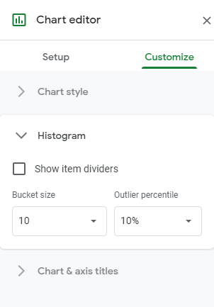
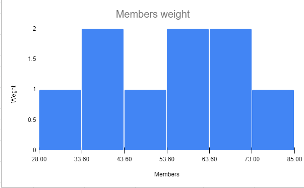
5. Once again click Customize>Histogram Just under the Show item dividers option, there are two boxes. Click Bucket size and Outlier Percentile to change the size of the buckets to your desired sizes.
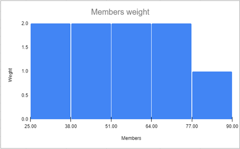
This will be the outcome
At times when working with data on google sheets, you are required to create histograms to make your data more presentable, easy to understand and draw better conclusions. Organizations use histograms from previously analyzed data to make decisions on certain important issues affecting them. Researchers as well as use graphs to explain the prevalence of a certain problem as well as perform statistical predictions on the future of such issues. Google Sheets allows users to create graphs from their data through their chart features.
The chart feature in google sheets is a useful tool which can change a bulky data into a digestible format.