An axis can mean an imaginary line through which a body rotates on, a good example is a spherical object which revolves on its axis. It can also mean a fixed reference line for the measurement of coordinates or even can mean a straight central part to which other parts are connected.
There are two major types of axes; x-axis and y-axis. The X-axis is usually horizontal running from left to right whereas, on the other hand, the y-axis is vertical running from top to bottom. The x and y-axis together meet at a point known as the origin.
Axes in Google sheets help represent data in a more clear and elaborate format understandable to viewers or the data analysts.
The following are steps to make x and y axes in Google sheets;
Step 1
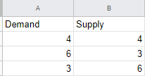
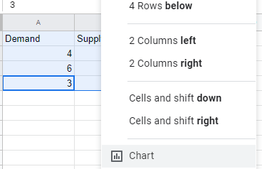
On your computer open a new spreadsheet and create some general data in it. You can use demand and supply as your two columns, column A demand, and column B supply.
Step 2
Select the demand and supply columns from the spreadsheet you have just created and click on the insert button that appears on the toolbar. Scroll down till you get the chart command and click on to enable you to insert a chart of your preference.
Step 3
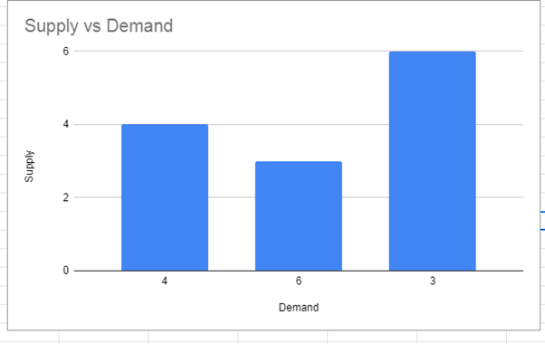
A chart of supply vs. demand appears once you have clicked on chart command, on the right side you will see the chart editor window, select on setup to choose the type of chart you wish to use be it column chart, line chart, etc. In my case, I am using the column chart but any chart type will also lead you to the main idea which is making the x and y-axis.
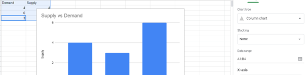
On the chart that has recently displayed on your spreadsheet, you can see that the A column with the demand values will appear or rather appears on the x-axis which is the horizontal line whereas the B column with the supply values will appear on the y-axis which is the vertical line of the chart.